Tango as a dance form developed in the early twentieth century in Argentina. It is danced in couples, with asymmetric roles for the partners, typically with a man leading and a woman following. It has basic principles of communication for movement, and a vocabulary of standard steps, but essentially the dance is improvised in response to music, partners and mood. This makes it similar to conversation or jazz, where standard formulae exist, but endless variations are possible, some more entertaining than others.
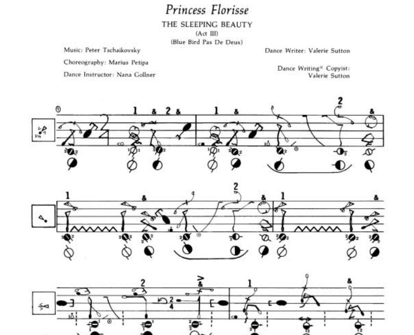
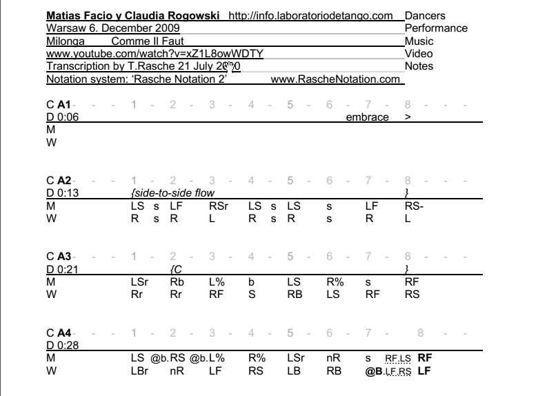
Just as music and conversation can be recorded as audio, dance can be recorded as video, allowing the improvisation to be reviewed. However, while conversation and music have conventional forms for graphic representation (transcripts and musical score), often easier for analysis and learning, dance, and tango in particular, has no standard form of notation. Various systems have been developed, but none are standard:
Given the ubiquity of motion sensors on mobile phones, could we develop a system of visual representation useful in understanding improvised choreographic composition in tango? "Patagraphy" is an initial attempt to address this question, using visualisations generated from recordings of motion sensor data from iPhones attached to dancers' lower legs and chests. These are most important body co-ordinates in the dance, as the chest communicates movement intent and the legs execute it, with the arms remaining relatively fixed.
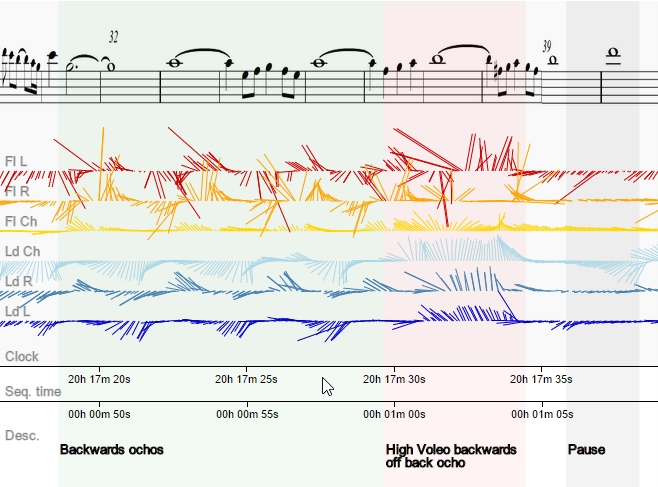
Three initial questions can be asked. Firstly, do these visualisation help us to identify the steps and sequences performed in a tango? By looking at the plots of set movements (PS_movenents and PVb_movements), we can see that steps can easily be distinguished.
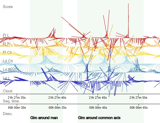
The rythmical quality of movements can be seen and related to the music, as in the "ochos" below. Also apparent are pauses (the musical use of pauses is a significant choreographic innovation in tango).
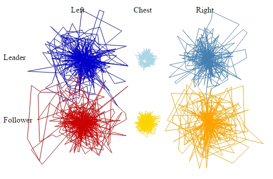
Secondly, can we use visualisations of movement data to understand the differences between different dancers? Here radial plots can make a comparison between two pairings, "PVb" and "PS", interpreting the same song. This gives an abstract representation of the whole dance, showing "PVb" to be a more controlled and precise couple:
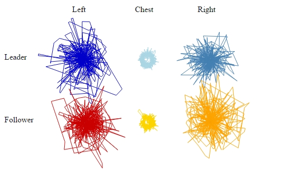
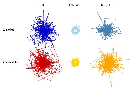
Finally, can we understand musical interpretation better through visualisation? Two contrasting songs were chosen for this study, the slow, lyrical and wistful "Poema", Pugliese's intense, lustful and industrial "La Yumba". The difference can be seen in radial plots from the same couple:
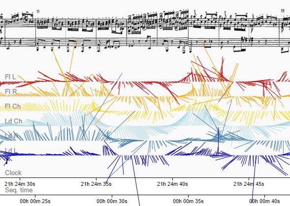
By comparing the linear plots to the score, one can also distinguish musical interpretation. Here musical accents in a driving musical sequence of La Yumba is mirrored by strong accelerations in the visualisation, and the rotation of the couple reflects the musical phrasing:
Are such visualisations useful? As a means of producing the feedback required for technical and artistic progress in dance, the mirror, the video camera and a good teacher are doubtless more effective and less invasive, but the visualisation add extra angle, helpful particularly in getting a temporal overview of the composition of a dance, something which is difficult for the human kinetic imagination. Possible directions for further development (beyond the obviously necessary collection of more data) include application to other sports which rely on precision in movement, such as rock climbing, or the development of short timescale feedback systems for drilling movement.
The data for this project were produced by using an iPhone app called SensorLog, which records data from the phone's motion sensors. Three iPhones were used per dancer, one mounted on the outside of the lower calves, to record leg or foot movement, and one mounted on the middle of the upper back, to record chest movement. The iPhones were attached using neoprene phone holders with Velcro straps. It should be noted that iPhone 3GSs were used on the chest and iPhone 4s on the legs. This limitation was caused by shortage of iPhones, and does affect the work, as the iPhone 3 has fewer motion sensors and in generally they are less accurate. When measuring acceleration, the iPhone4 will also distinguish user acceleration from general acceleration (which includes gravitational attraction). This was compensated for by subtracting 1 from the z axis acceleration figures for the iPhone 3, but this is a crude adjustment.
The captured were recorded directly to the phone, as WiFi transmission proved unreliable. This created a difficulty in synchronising the data, since the clocks on the iPhones cannot be relied upon to be synchronised - though in practice they are usually within two seconds of each other. This problem was handled by performing a series of simultaneous rotations of all the phones, stacked on top of each other, at the beginning and end of the recording. The movement is recorded by SensorLog and these recordings can be used to align the data from different iPhones. The adjustments required were +/- up to three seconds.
During recording, it is very important that the SensorLog application is not disturbed! In practice this means putting the phone in airplane mode, so no calls or other signals can disturb it; disabling the auto-lock function; closing all other applications; and making sure the phones are fully charged, as the low battery warning disables operation.
Two cameras were used to record the dance as well. One was an iPhone 5 camera, and the other a GoPro 2 camera. The latter's "fisheye" lens is very useful for capturing dance, as it effectively captures a whole room, at price of some distortion. The videos captured were uploaded to YouTube and are displayed and controlled using the YouTube API.
The code for the project is written in Javascript (view the source of this page to read it). The visualisations are SVGs produced using d3.js, a Javascript library for mapping data to document elements. D3.js reads the CSV files produced by SensorLog and combines it with data specified in the patadata.js file to produce the charts.
Various settings for the visuals were tested, but using combined absolute acceleration for the line length and the magnetic heading value, approximately offset for the orientation of the phone on the body, proved the informative. The headings though should not be taken as absolutely accurate, but the relative motions are meaningful.
One of the strengths of producing visualisations digitally is that once created (coded), it is easy to create visualisation for new data. Some improvements to the technique would be required though if visualisations are to be produced straight after the dance: mostly with regard to the problem of time synchronisation between the recording devices. Probably the easiest approach would be to have a method for syncing the clocks of the phones exactly before recording.
Thanks to Maité Delafin for offering initial ideas for this project, to Vanessa, Sharon, Michael, Iain, Florian and John for dancing, to David for the loan of IT equipment and iPhones, and to the Glasgow School of Art's Brian Dixon for advice and suggestions of graphic forms.
Thanks to Roberto Rabinovic for providing the musical score for Poema, to Michael Freedman for the introduction to Murat Erdemsel's work, and to Tom Harris for use of his GoPro camera.
Thanks also to the developers of the software used, in particular Bernd Thomas for SensorLog and to Mike Bostock for the excellent d3.js library.